The Datlas project leveraged proprietary research from the Harvard Center for International Development Growth Lab to explore the economic diversity of Colombia.
Challenge
While the visualizations were robust and well developed, the Growth Lab team recognized that the experience of moving in and out of this data as a usable tool had received less attention and resources. Time was a forcing function — I joined about three months from launch.

Audit
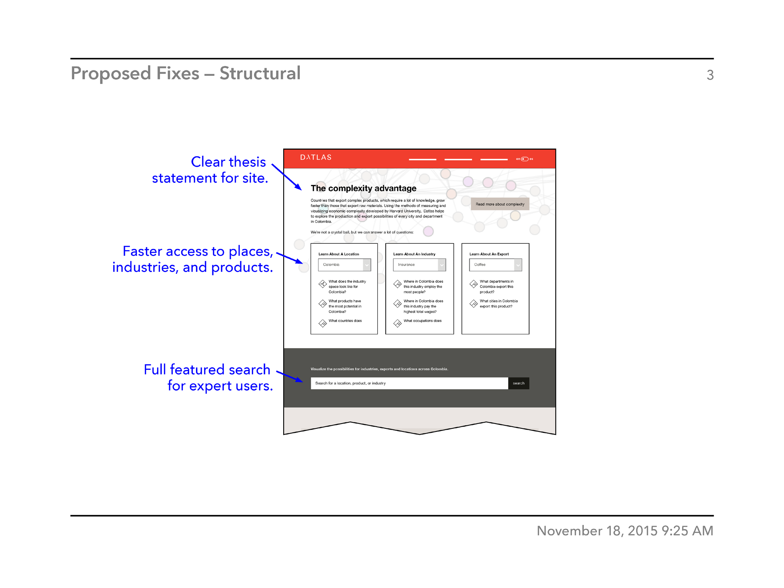
The first step was assessing the UX of the existing site. I proposed a set of pragmatic interventions that could be accomplished in a limited timeframe. These included:
reworking the landing page with clearer language and hierarchy,
introducing persistent header navigation on all interior pages,
simplification of url path routing,
wrapping existing data visualizations with better contextual information, and
refinement of color palette and typography throughout the site.


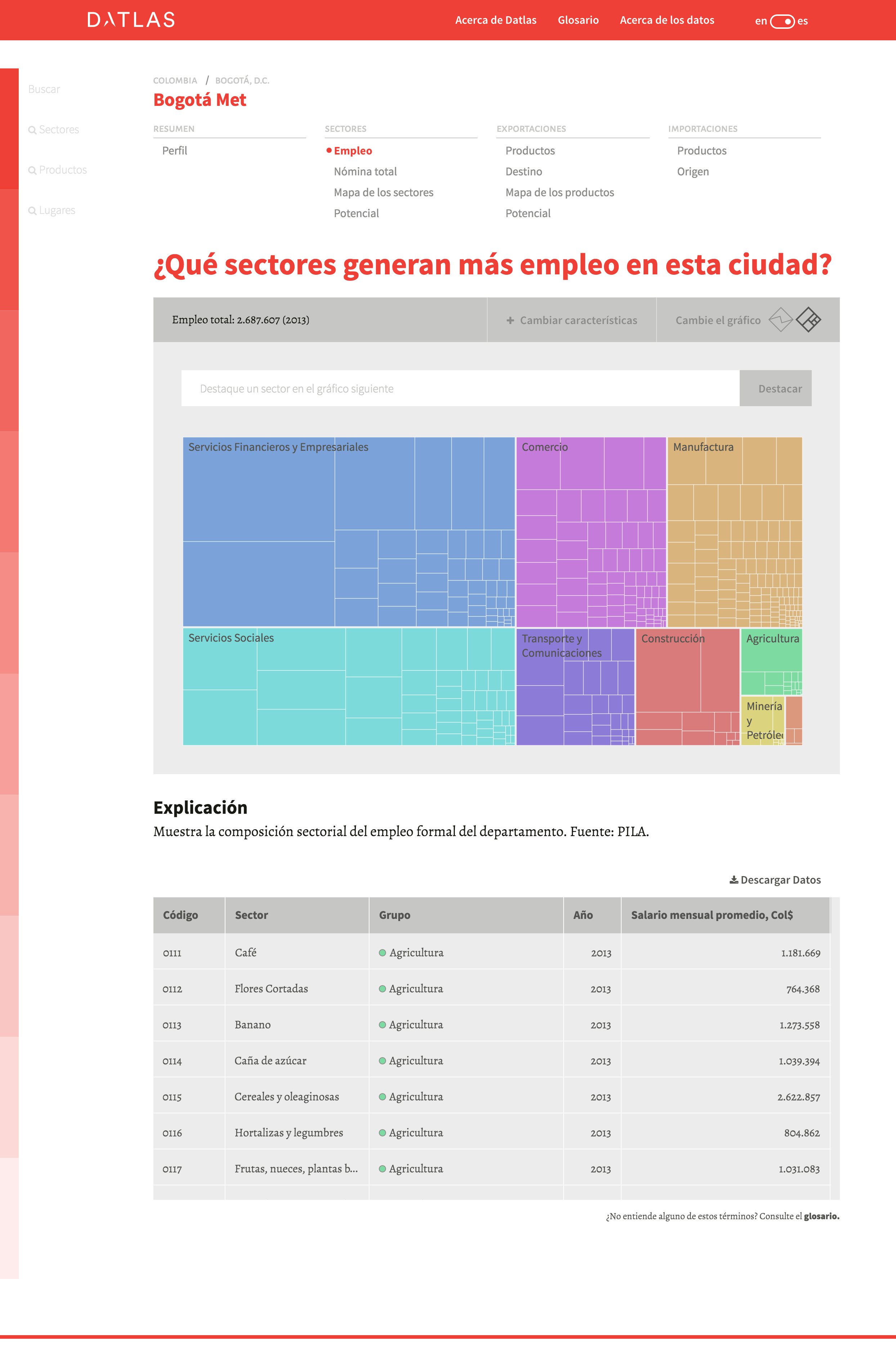
Data visualizations
One area of focus was the site’s existing data visualizations. They were sophisticated but often lacking in the appropriate UX wrappers for users to really engage with them. There were also areas of opportunity for new, more dense presentations of existing data:

High fidelity
Once the initial audit was complete and agreed upon, I spent several months embedded in the development team of the Growth Lab, implementing these proposals as well as providing design and frontend development support prior to launch. I was an active contributor to the team’s code base, working specifically with the site’s Ember frontend templates, Less stylesheets, D3 visualizations, and custom icon fonts.